Anevo Branding
A brand identity for a B2B outbound growth partner that turns inconsistent lead generation into a predictable growth engine.
Role
Brand Identity & Strategy
Timeline
2026
team
Anevo
platform
Brand Identity
The Brief
Anevo is a B2B outbound growth partner that helps companies generate qualified meetings, pipeline, and revenue through structured outbound systems.
The brand needed to feel the way their service works: organized, premium, and performance-driven, built around clarity, momentum, and results.
The Mark
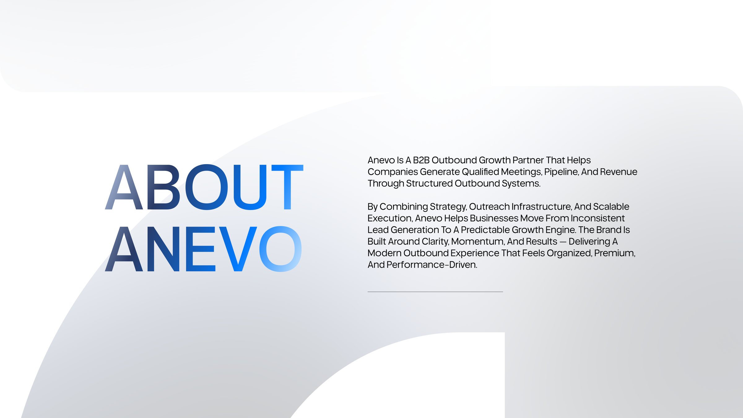
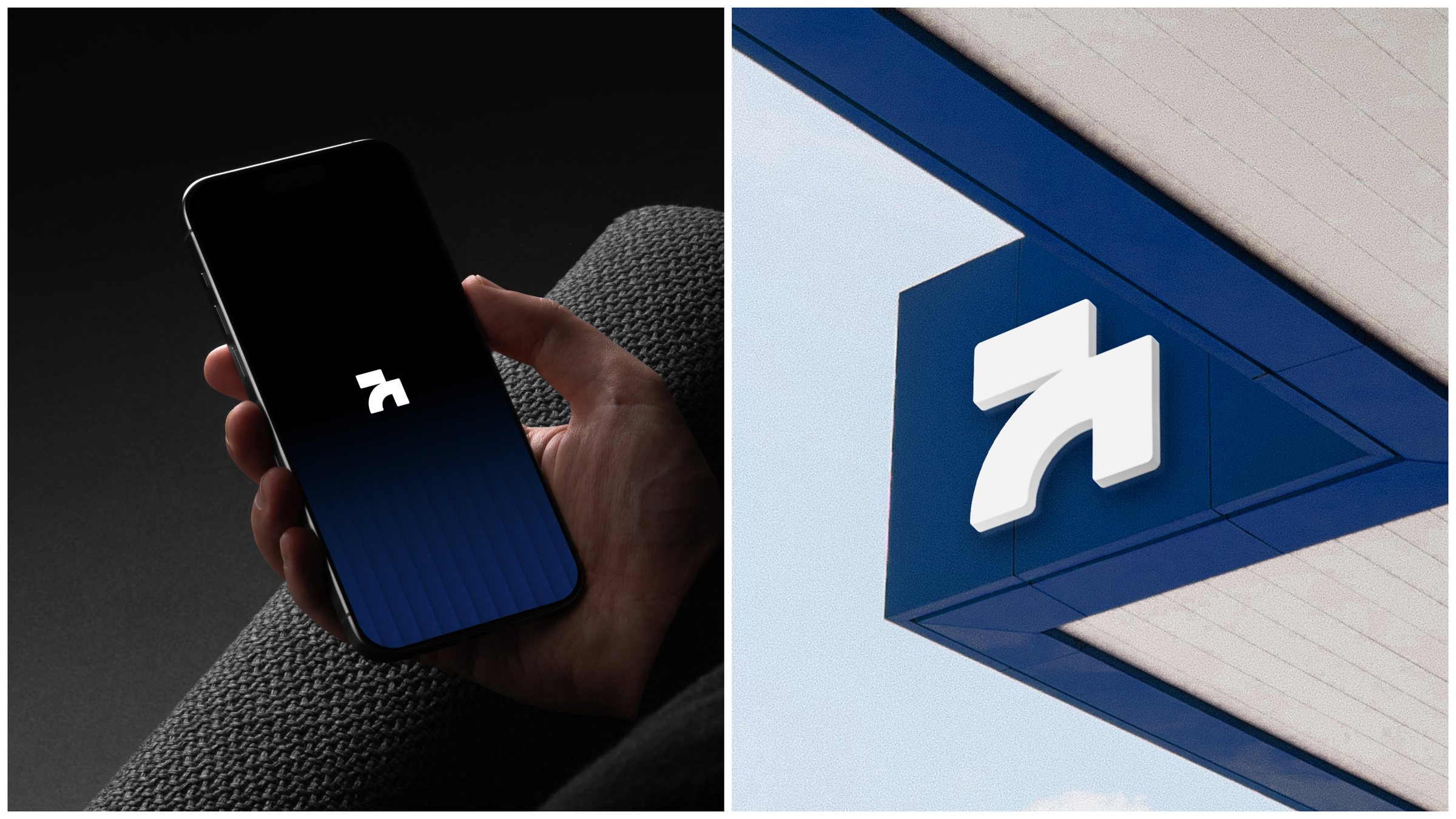
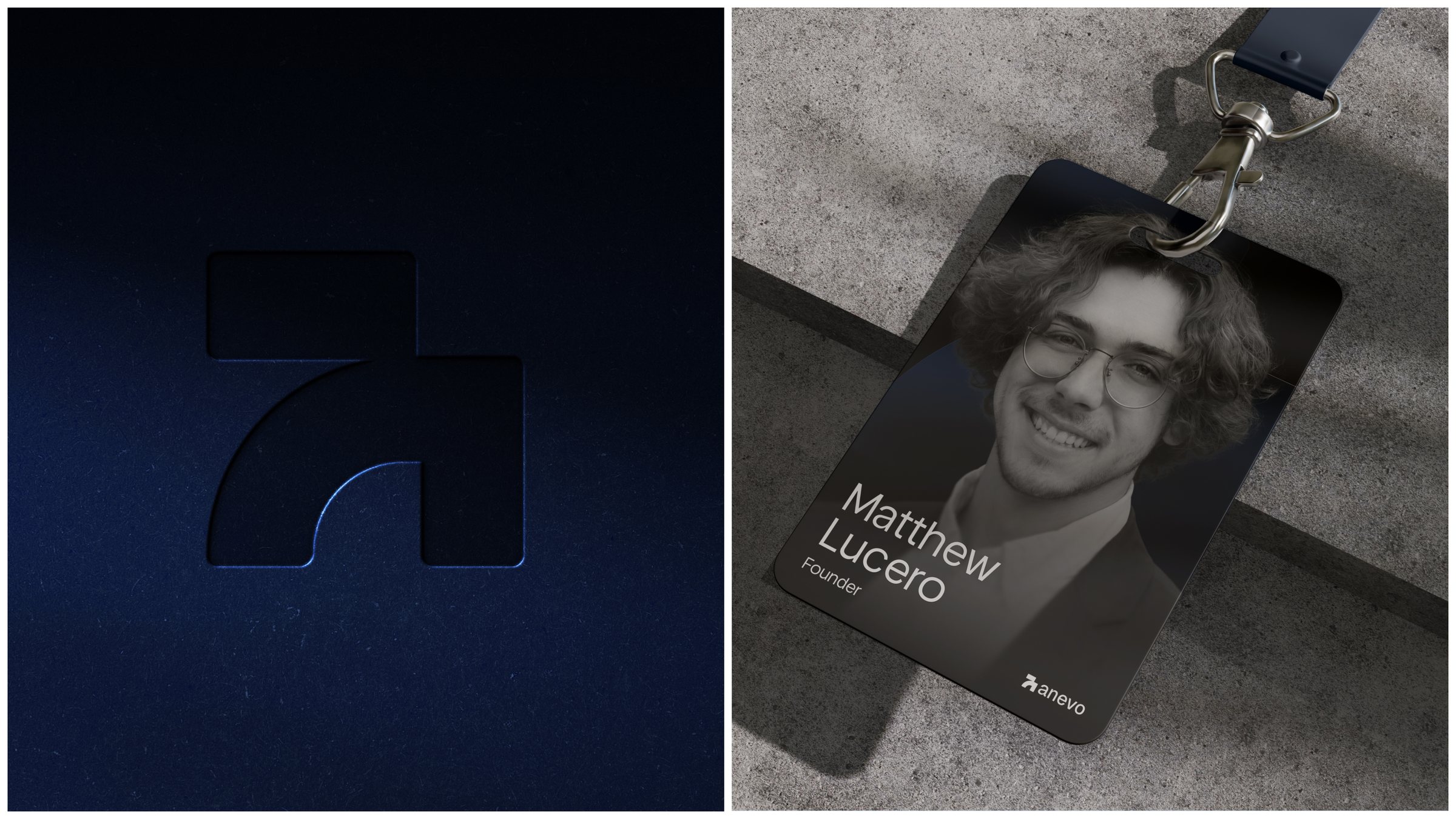
The symbol is an upward arrow formed from a solid block and a sweeping curve, a direct expression of momentum and growth.
Its geometry is built from a few precise shapes, so it stays bold and recognisable as an app icon, a profile picture, or a favicon.
Lockups & Colour Versions
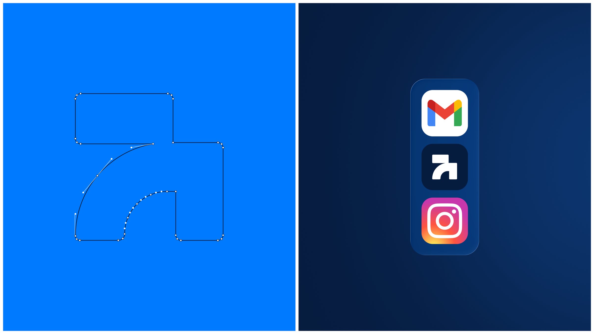
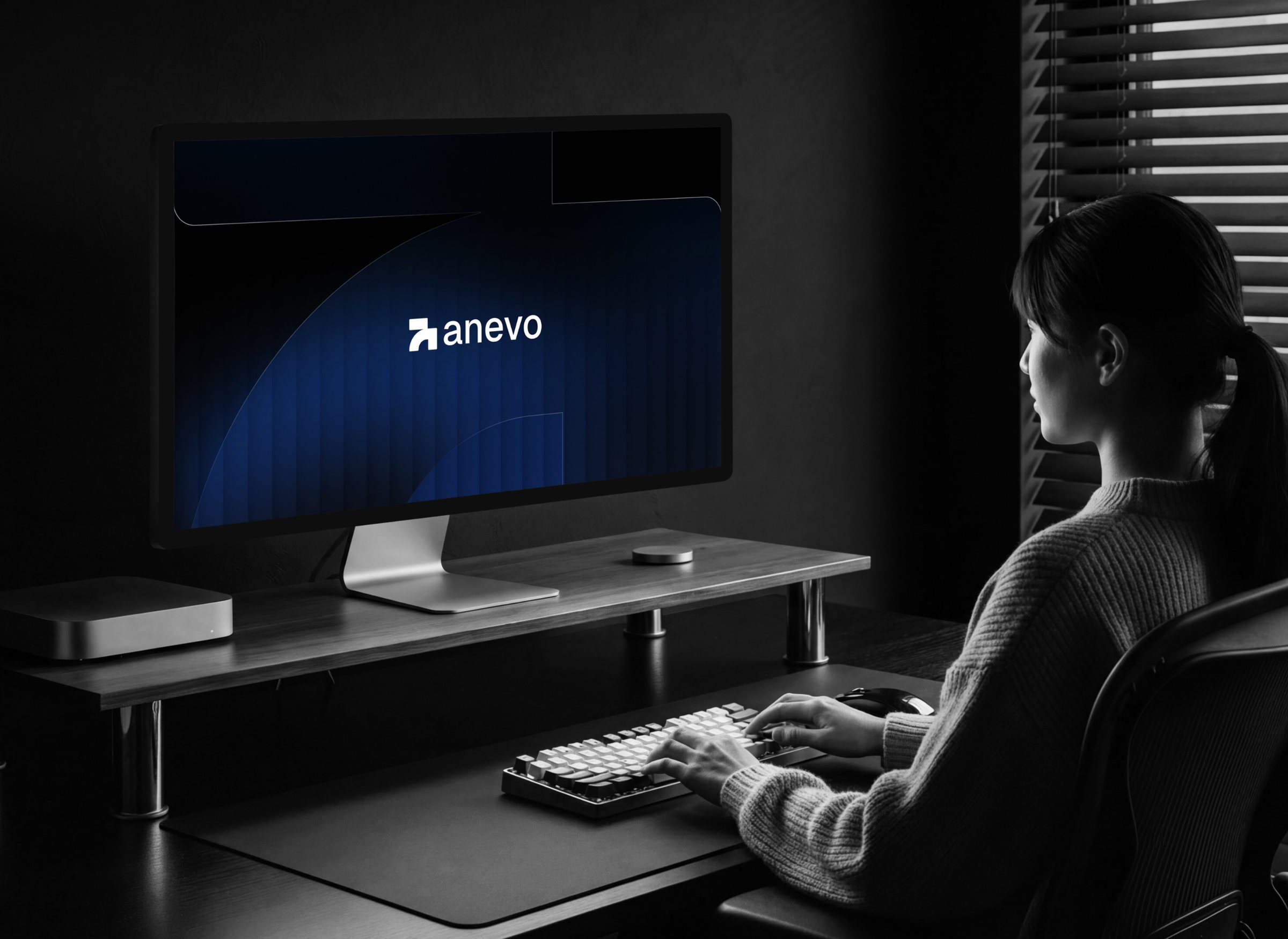
The mark pairs with a friendly lowercase wordmark and holds its legibility across every brand background, from Deep Navy to Electric Blue and white.
Colour Palette
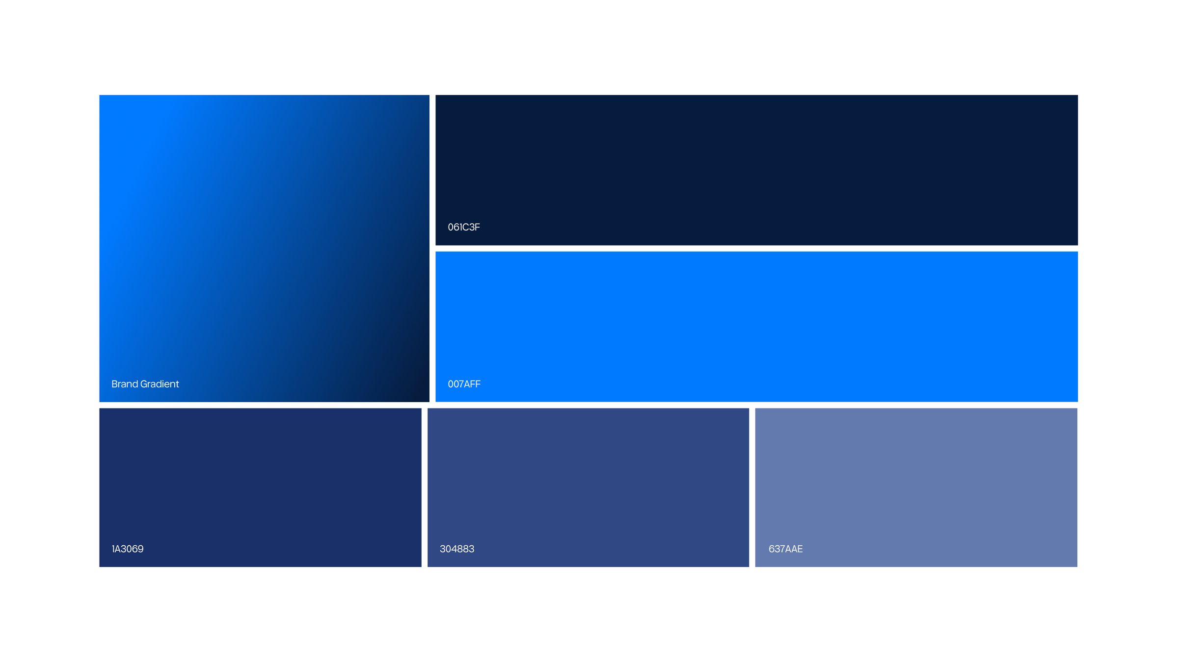
The palette runs from Deep Navy (#061C3F) to Electric Blue (#007AFF), supported by #1A3069, #304883, and #637AAE, with a signature blue-to-navy brand gradient.
Typography
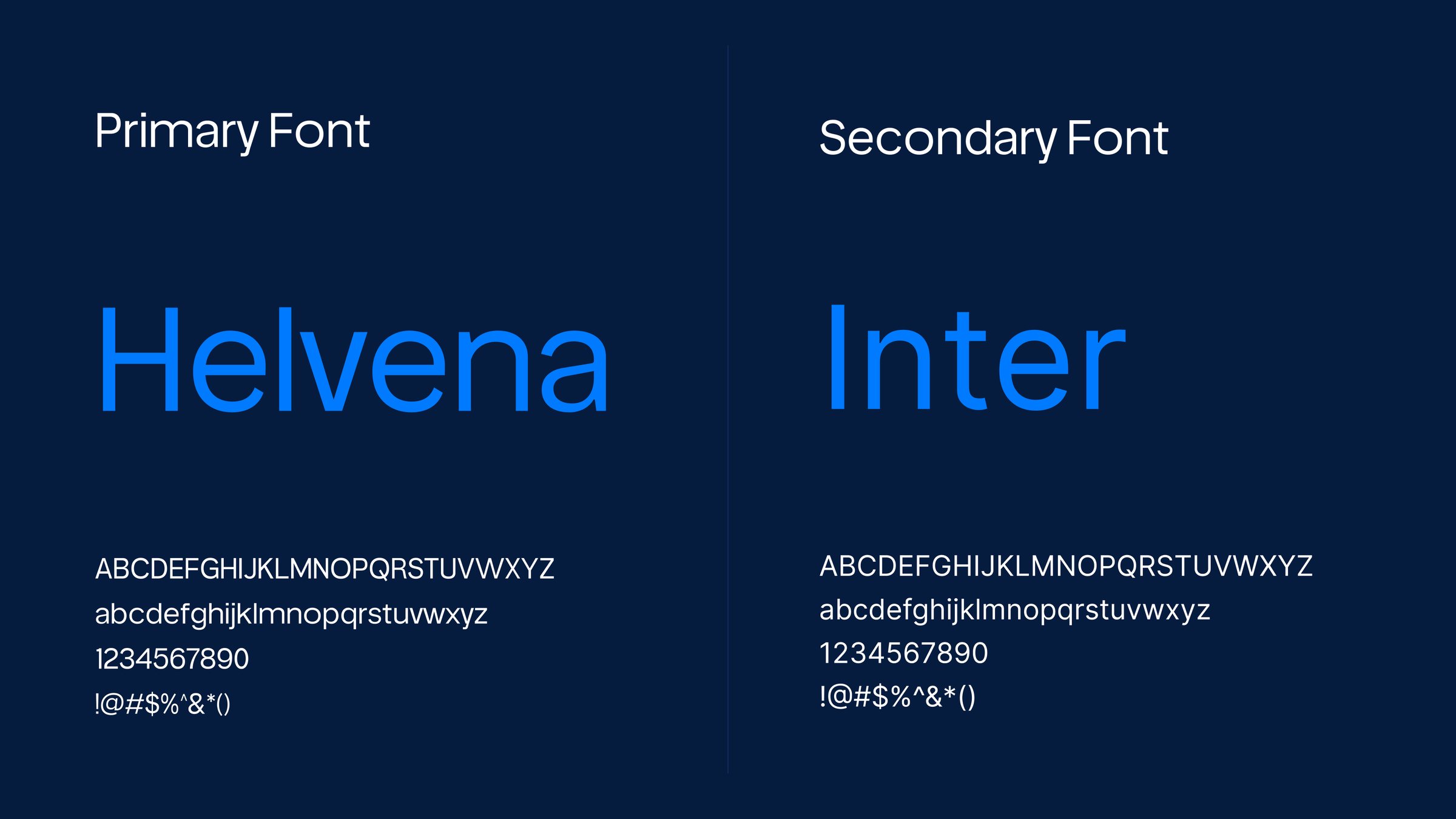
Helvena, the primary typeface, gives headlines a modern, confident voice. Inter supports it as the secondary typeface, keeping body copy clean and highly readable.
The Brand in the World
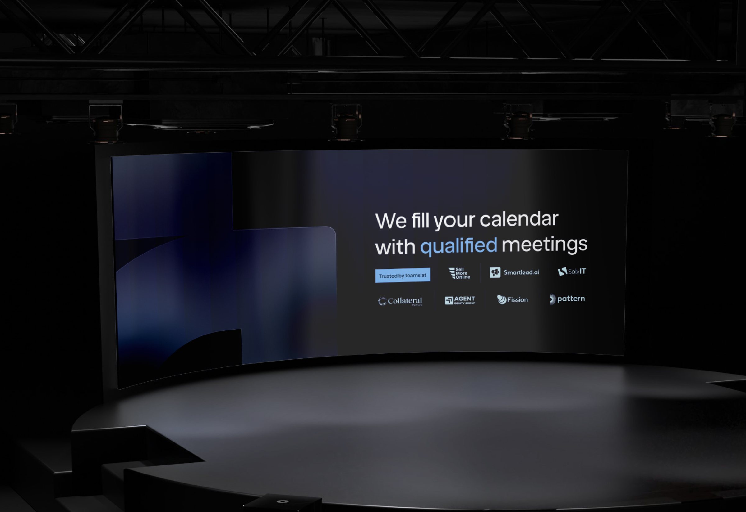
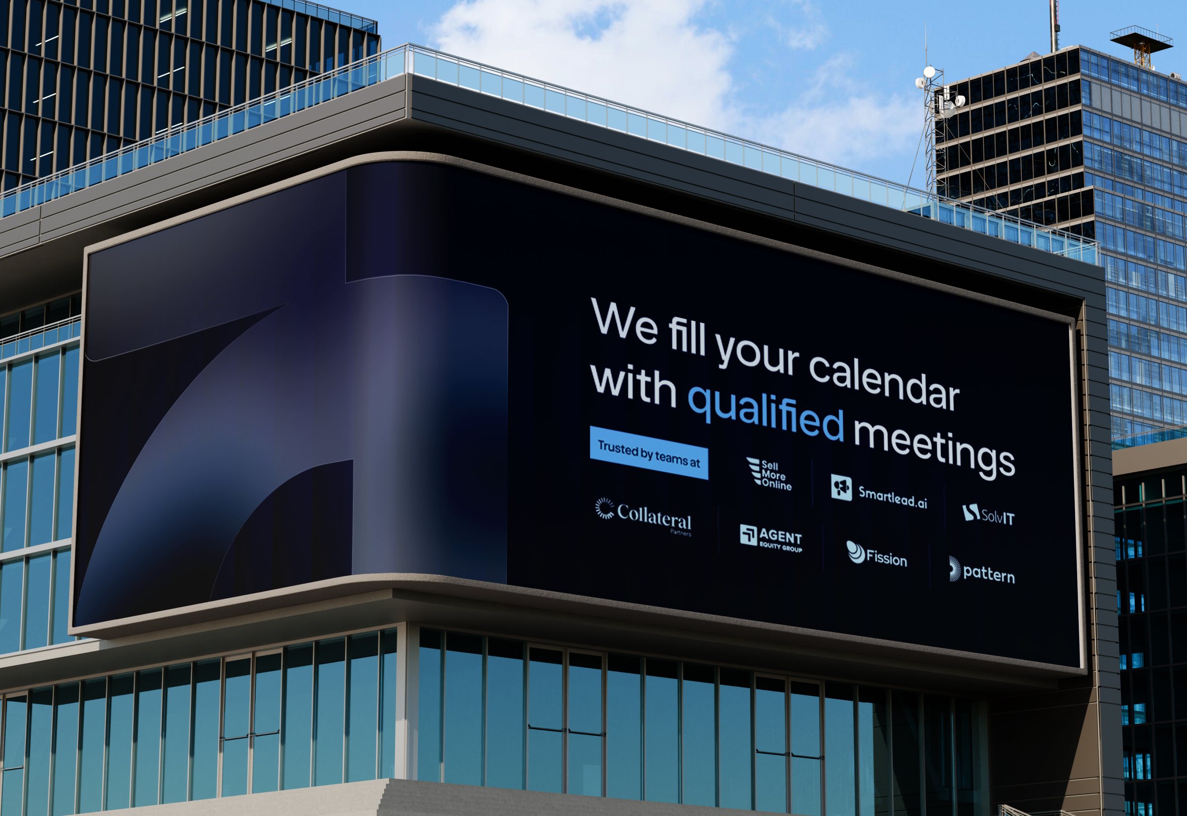
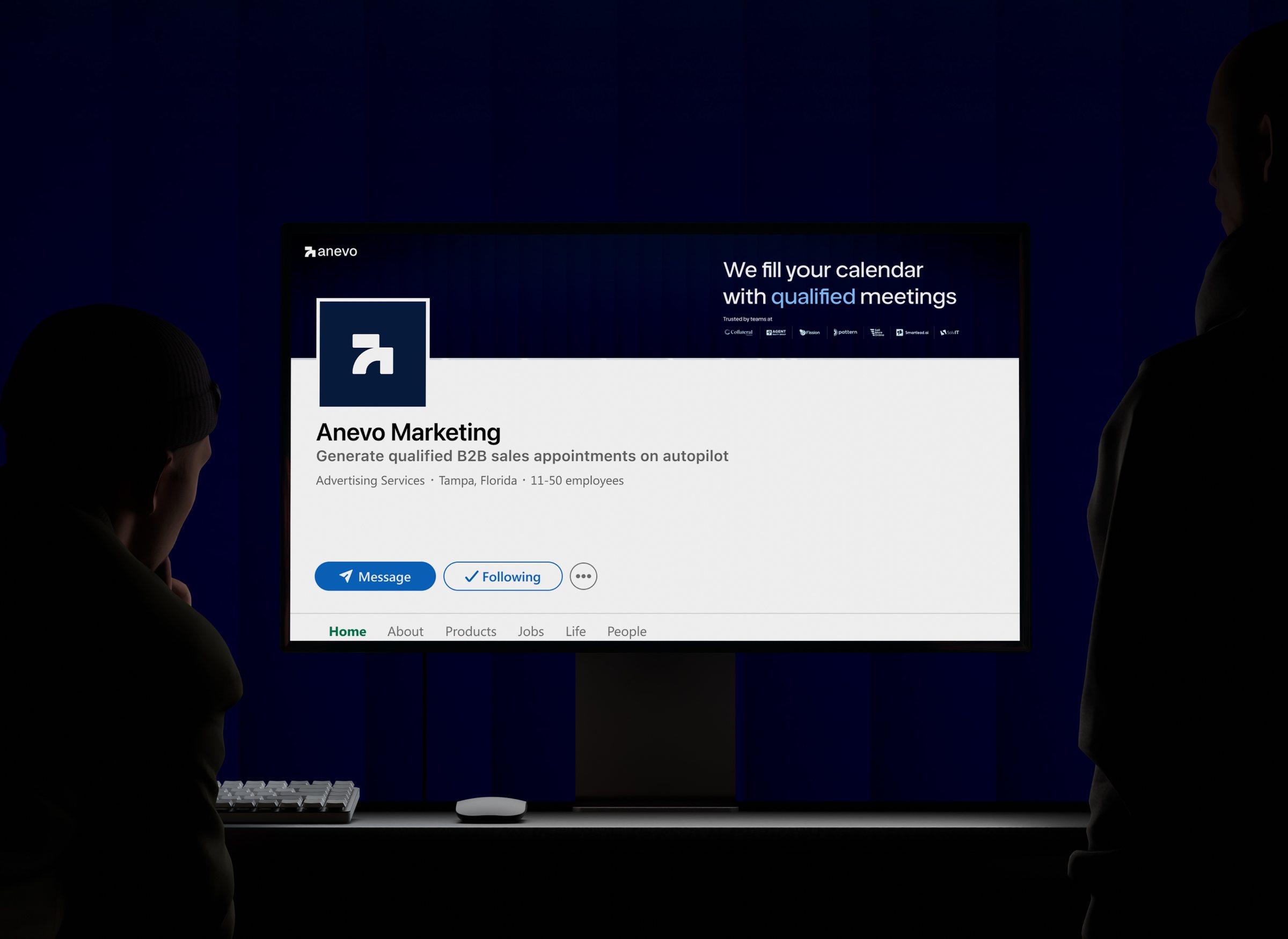
From event stages and billboards to signage, mobile screens, and LinkedIn, the identity carries one clear message everywhere: we fill your calendar with qualified meetings.

Book a call
Let's make something happen.
Building a product, launching a startup, or rethinking your website? Pick a time that works for you and let's talk through your project, goals, and next steps.