Nation Branding: Direction 2
A playful, colour-rich identity direction for Nation, the agentic Shopify, built around a smiling mark that makes starting a business feel joyful.
Role
Brand Identity & Strategy
Timeline
2026
team
Nation
platform
Brand Identity

The Brief
This second direction for Nation leans fully into joy. Nation turns one prompt into a store that builds, runs and markets itself, and the brand should feel like the moment your first sale comes in.
Where the first direction was bright and sunny, this one is tactile, colourful and friendly: a brand that makes selling online feel easy for anyone.
The Mark
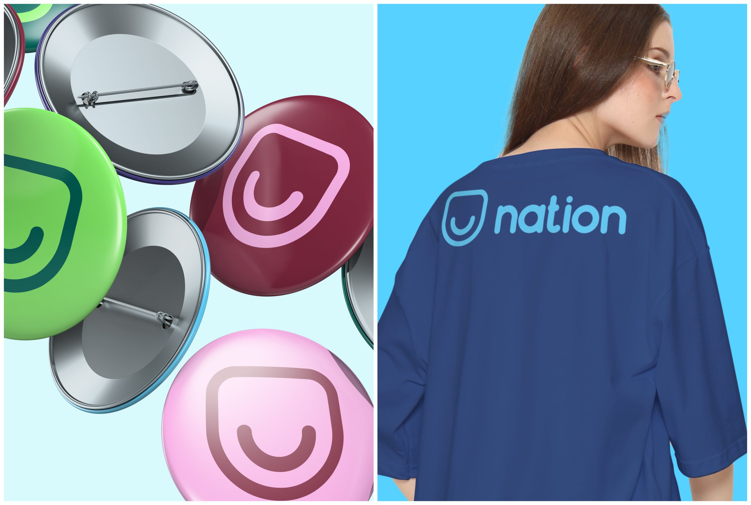
The symbol is a rounded shield holding a simple smile: a badge of trust that is also, quite literally, a happy customer.
Its soft corners and single-weight line keep it warm and approachable, and it works on its own as an app icon, pin or stamp.
Colour & Type
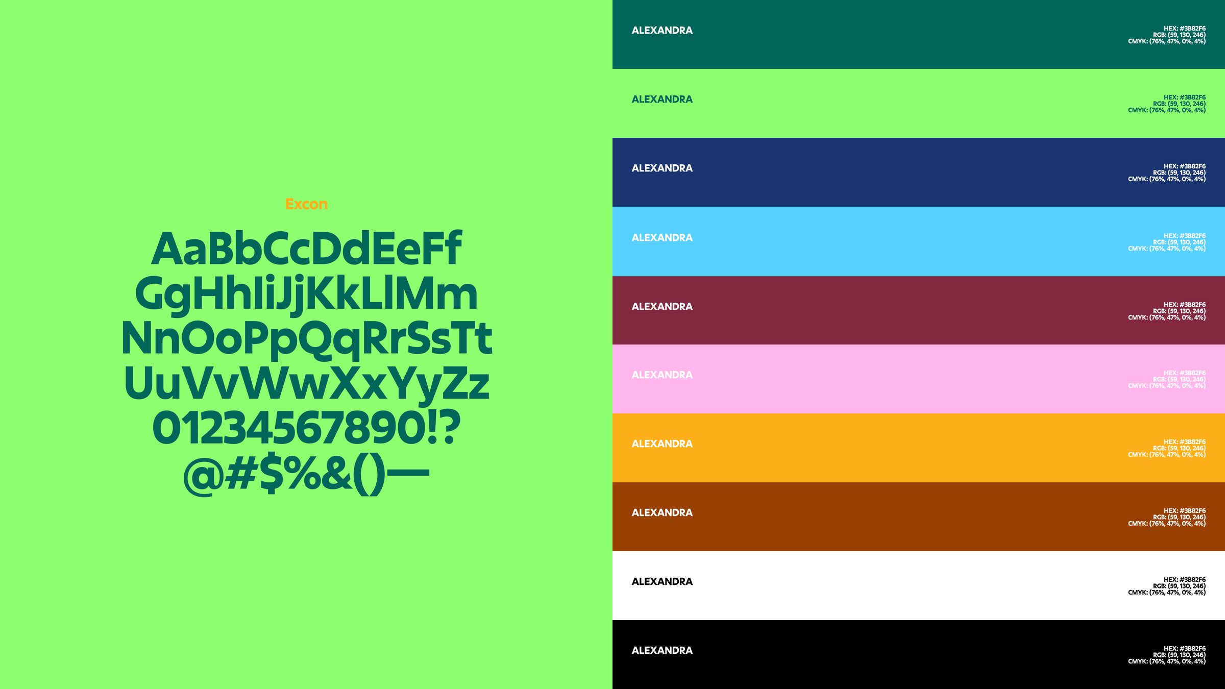
A wide, confident palette pairs deep tones with bright partners: Deep Teal (#00665A) with Lime (#8DFF6F), Navy (#19346E) with Sky (#56D1FF), Maroon (#822940) with Blush (#FFB6EC), and Amber (#FCAF18) with Rust (#984002), grounded by white and black.
Excon, a rounded geometric sans, carries the voice: bold, friendly and easy to read at any size.
Built for Campaigns
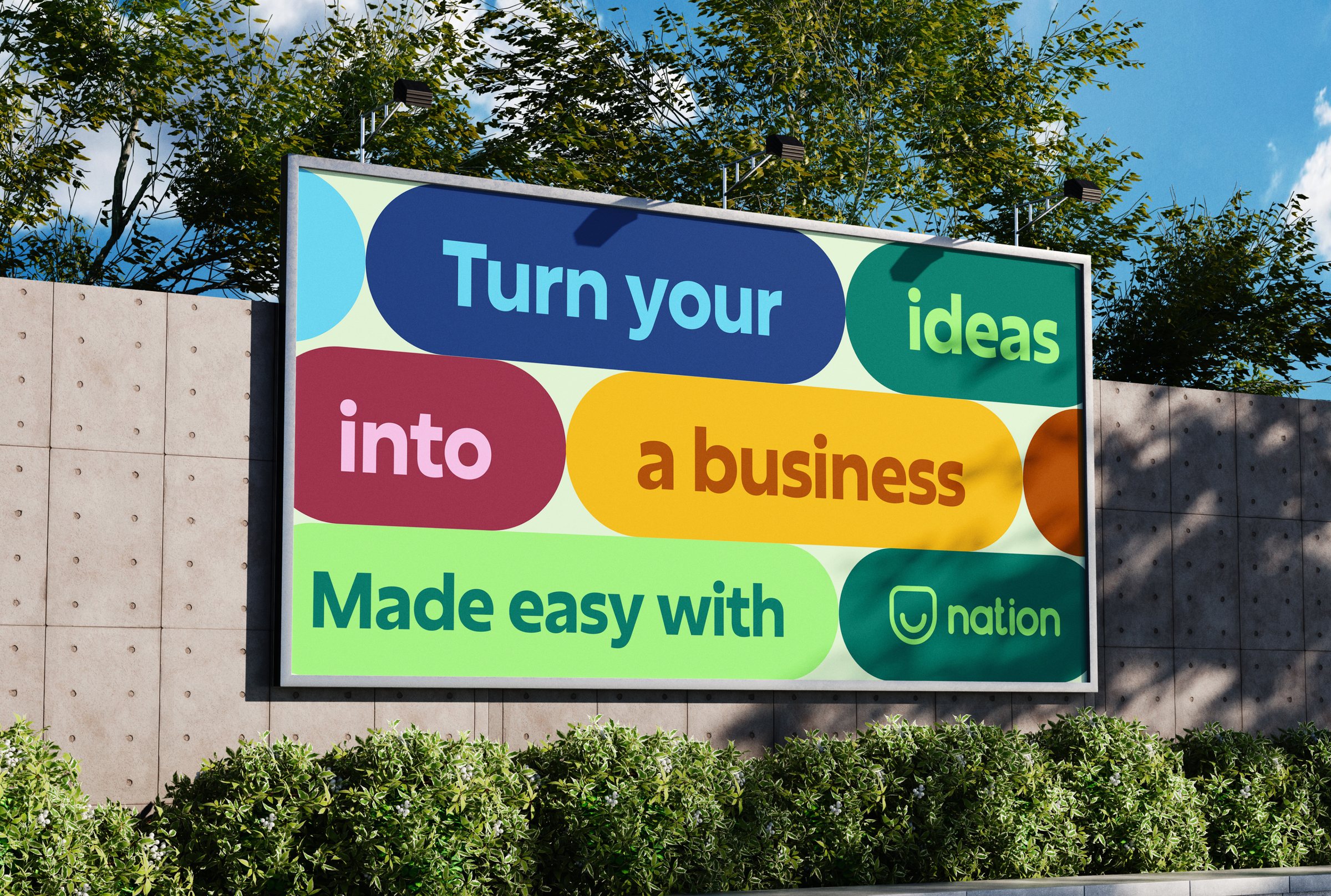
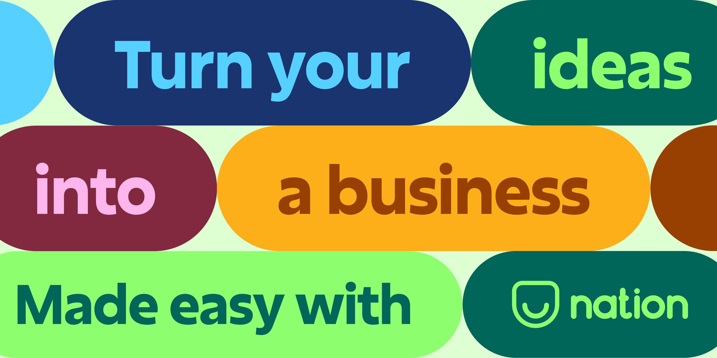
Pill-shaped colour blocks become the campaign system. Each word sits in its own colour pairing, so every message feels like a stack of small wins.
The same system flexes from billboards to social and web banners while staying instantly recognisable as Nation.
Book a call
Let's make something happen.
Building a product, launching a startup, or rethinking your website? Pick a time that works for you and let's talk through your project, goals, and next steps.