By Ans Ali
Web Design & Conversion
What Makes a SaaS Homepage Actually Convert?
summary
Learn how to design a SaaS homepage that explains your product, builds trust and guides visitors toward demos, trials or qualified sales conversations.
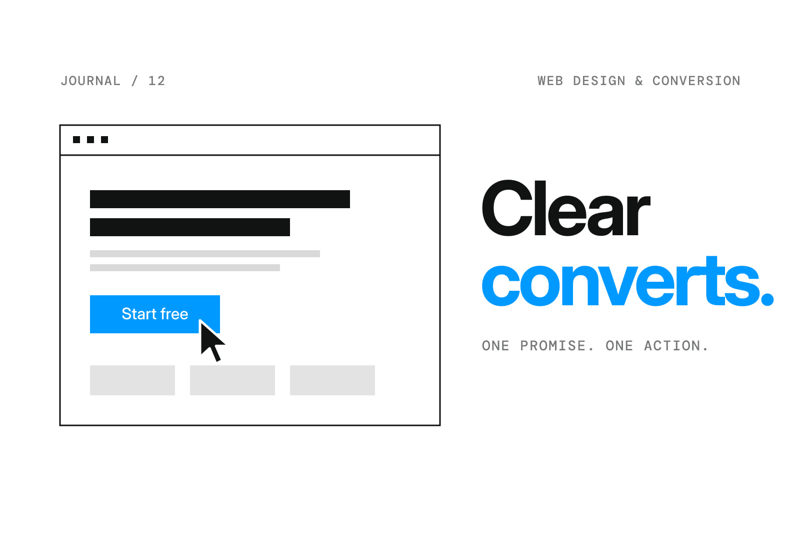
A SaaS homepage has a difficult job.
It needs to explain something that might be technically complicated, make the company feel credible, and help the right visitor decide what to do next.
That's a lot to ask from one page.
The short answer: An effective SaaS homepage clearly communicates the product, establishes who it's for, supports its claims with evidence, and gives visitors an appropriate next step. Visual quality helps, but clarity and relevance matter just as much.
I've spent a lot of time thinking about how to make complex technology easier to understand through design.
These are the decisions I'd focus on first.
1. Make the Hero Answer a Real Question
The first thing a homepage should communicate is what the company does.
That sounds obvious, but plenty of technology websites use headlines that could belong to almost any startup.
Words like reimagine, transform, and unlock don't tell someone much on their own.
A strong headline should create understanding.
The supporting description can then explain who the product helps and why it matters.
You don't need to describe every feature immediately.
You just need to make the next section worth reading.
2. Show the Product Early
If the product has an interface, demonstrate it.
A thoughtful screenshot, short interaction, or carefully composed product visual can explain more than a paragraph filled with technical terminology.
But the visual needs to communicate something specific.
An abstract dashboard full of placeholder charts might look polished, but it doesn't necessarily tell the visitor how the product works.
I prefer showing enough of the real experience to make the product tangible.
For technical products, a workflow illustration can sometimes be more useful than a conventional screenshot.
3. Build Trust Without Overexplaining
A homepage should help visitors feel confident that the company understands their problem.
Relevant customer evidence can help: genuine testimonials, recognizable customer logos used with permission, case studies, or clearly explained product capabilities.
The important word is relevant.
A page full of logos isn't automatically persuasive if the visitor doesn't understand what the product does.
Evidence should support a clear message, not replace it.
4. Organize Sections Around Decisions
Visitors don't all arrive with the same questions.
Some want to know how the product works.
Others care about integrations, security, pricing, or whether the company can support their organization.
A good page gives those people a logical path through the information.
One structure I often consider is:
What the product does
Why the problem matters
How the product works
What makes it different
Evidence that supports the claims
How to get started
It's a starting point, not a universal formula.
The right order depends on the product and audience.
5. Make the CTA Match the Buying Process
Not every SaaS company should use the same call to action.
A self-serve tool might benefit from Start Free.
An enterprise product may need Book a Demo.
A complex new technology might need See How It Works before asking for a meeting.
Think about the amount of trust required for the next step.
The CTA should feel like a natural continuation of what the visitor just learned.
6. Design for Real Devices and Real Attention
Good hierarchy matters on desktop, but it matters even more when the screen gets smaller.
Long headings, oversized visuals, and complicated interactions can become difficult to navigate on mobile.
I like reviewing a homepage at different widths while it's still being designed.
The goal isn't to make every element smaller.
It's to make the important parts easier to understand.
Performance matters too. A sophisticated visual experience shouldn't prevent someone from accessing the product information.
How Do You Know If the Homepage Works?
Look beyond whether the design looks finished.
Track meaningful actions, such as demo requests, trial starts, contact submissions, and qualified conversations.
Consider reviewing recordings, usability feedback, and where visitors leave the page.
Sometimes a better headline is more useful than a full visual redesign.
Sometimes the structure is the real problem.
The important thing is identifying what actually needs improvement before changing everything.
Frequently Asked Questions
What should a SaaS homepage include?
A clear value proposition, relevant product explanation, trustworthy supporting evidence, and an appropriate conversion path.
Should a SaaS website show product screenshots?
Usually, showing the product helps make the offering tangible. Use screenshots or demonstrations that communicate real functionality rather than decoration.
How long should a SaaS homepage be?
Long enough to answer the important questions, but not longer than the audience needs. Complexity and buying intent should determine depth.
Can better design improve SaaS conversions?
Design can improve clarity, trust, and usability, which may contribute to conversions. The effect should be measured rather than assumed.
Your product deserves a clearer story.
I help technology startups turn complicated products into websites people can understand and take action on.
Book a call
Let's make something happen.
Building a product, launching a startup, or rethinking your website? Pick a time that works for you and let's talk through your project, goals, and next steps.