Clarity Design Studio
A brand identity for a web design studio built for GTM & RevOps agencies that are done looking smaller than the results they deliver.
Role
Brand Identity & Strategy
Timeline
2026
team
Clarity Design Studio
platform
Brand Identity
The Brief
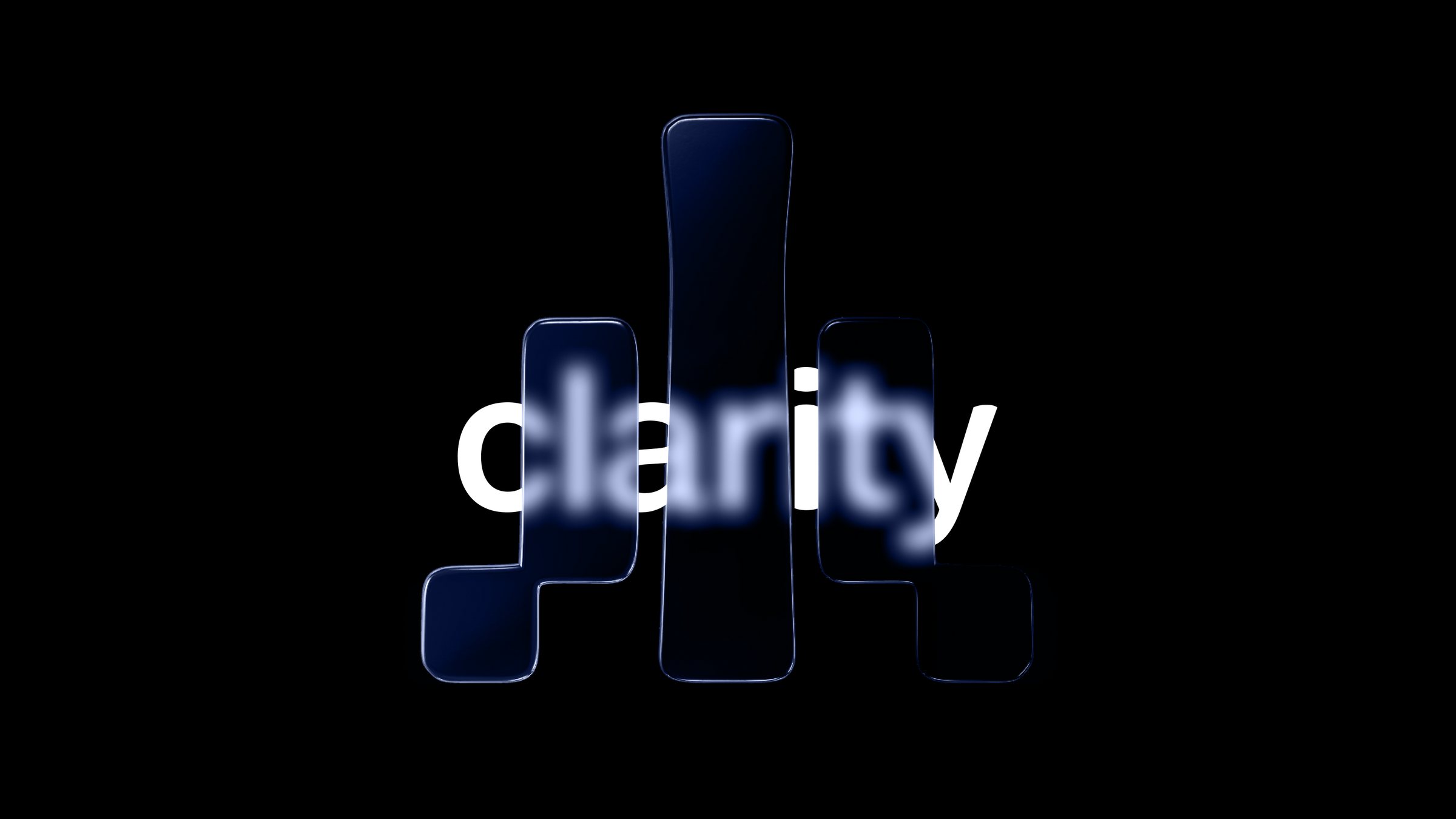
We were tasked with rebuilding the brand identity and visual presence of a web design studio operating at the intersection of positioning, copywriting, and conversion-focused design.
The result is Clarity Design Studio, reborn: an identity for a studio that specialises in websites, messaging, and visual systems for GTM & RevOps agencies.
The Mark
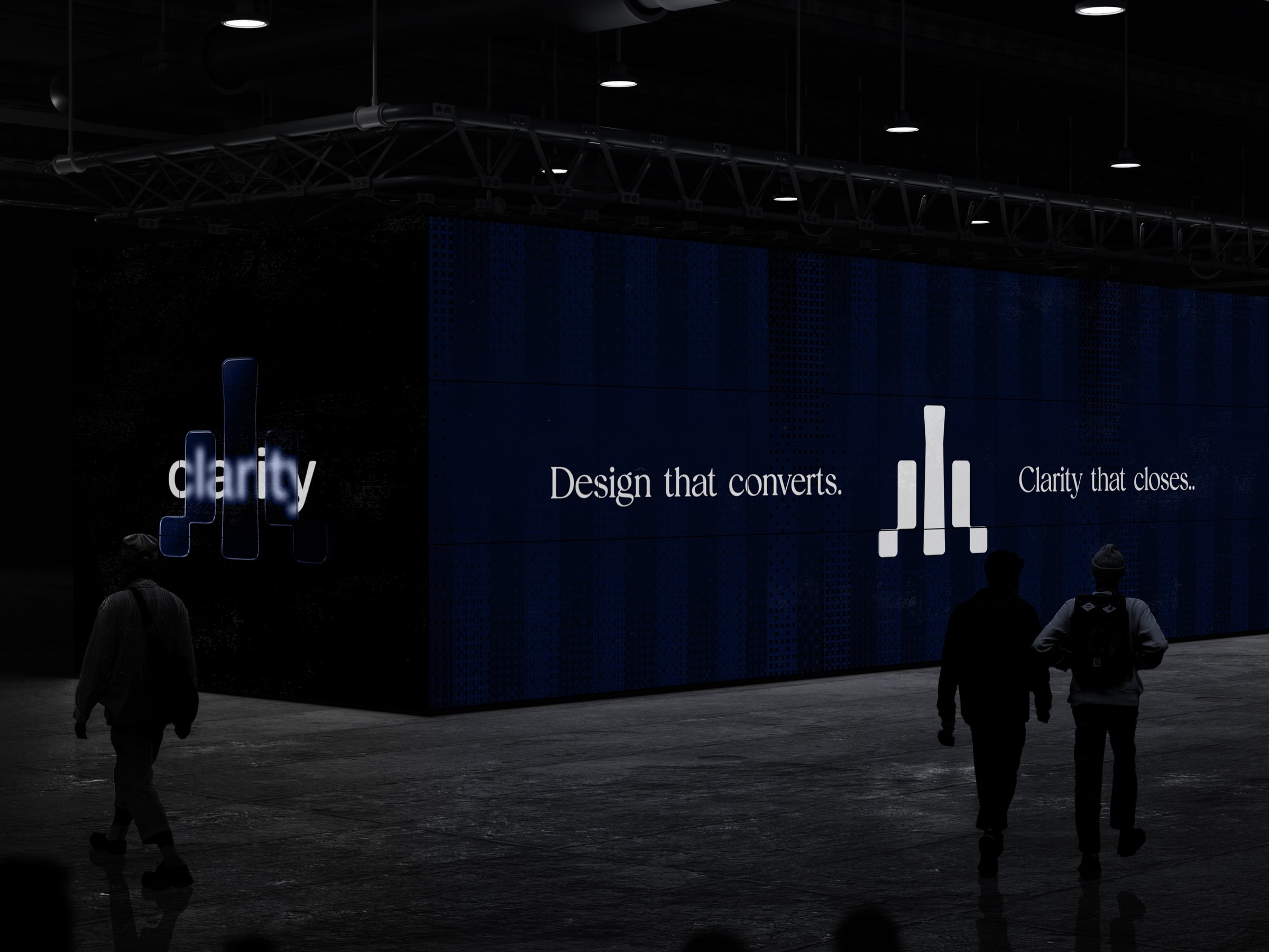
The creative direction was built around confidence and restraint. A brand that earns authority without announcing it.
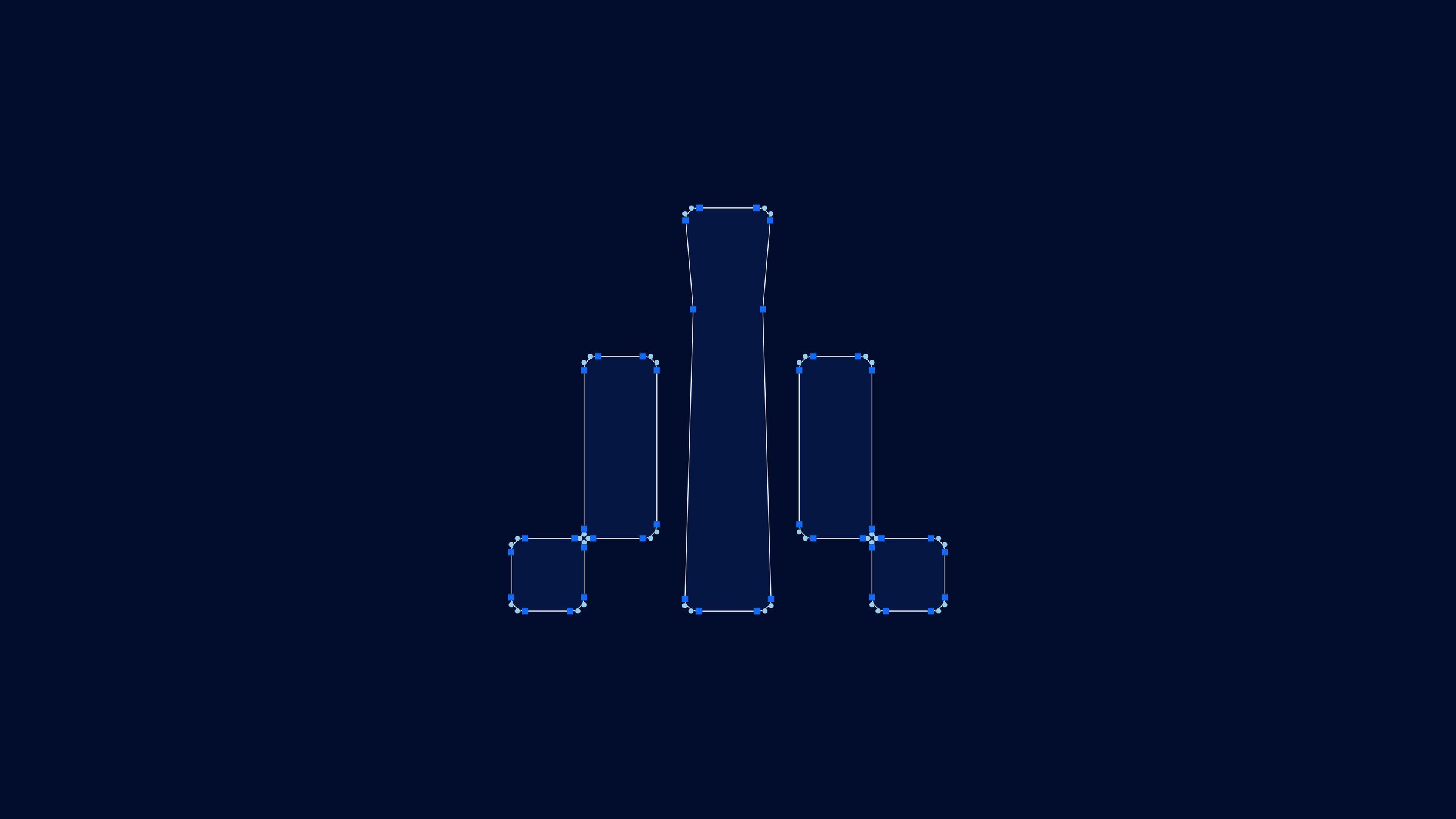
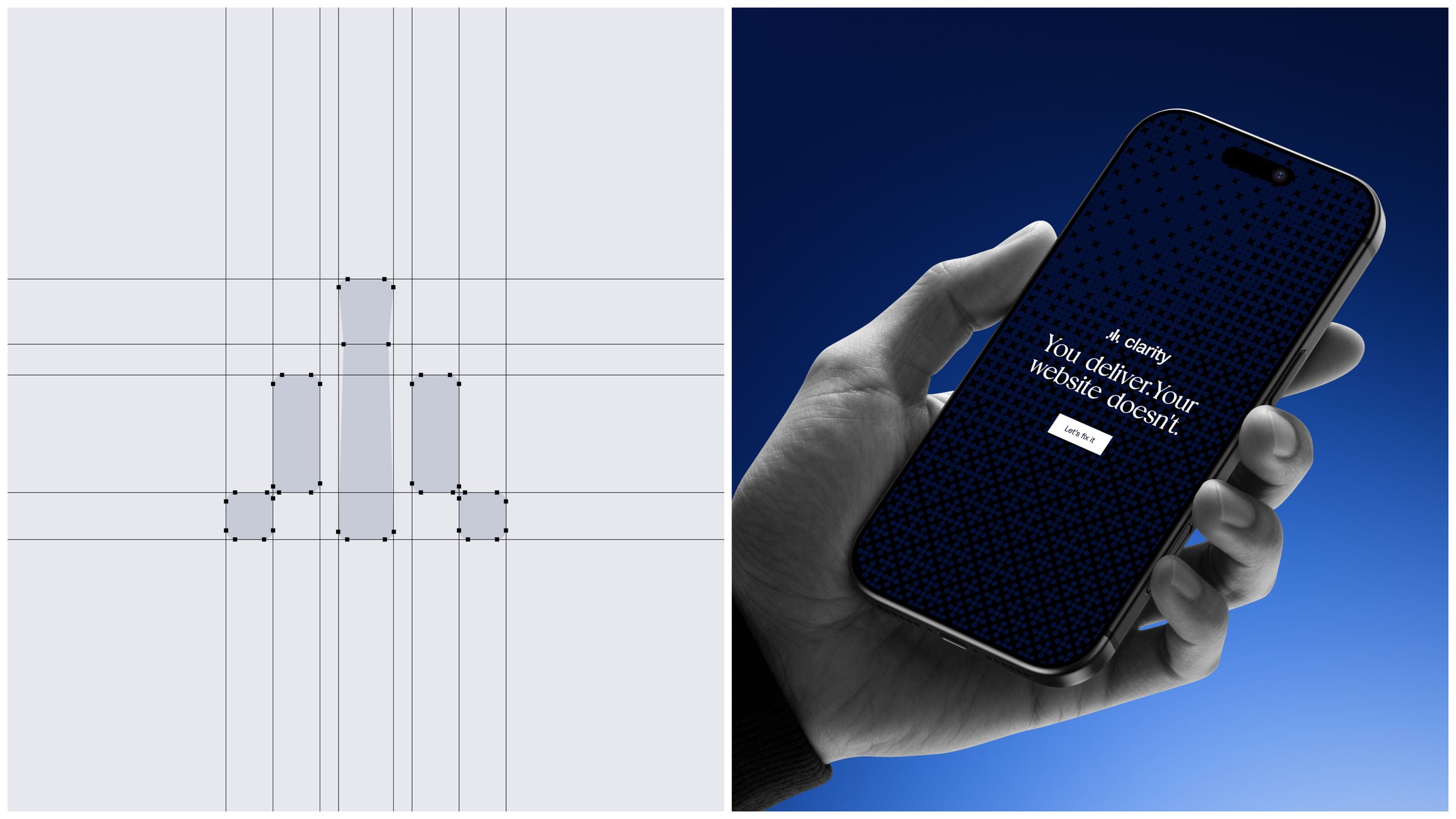
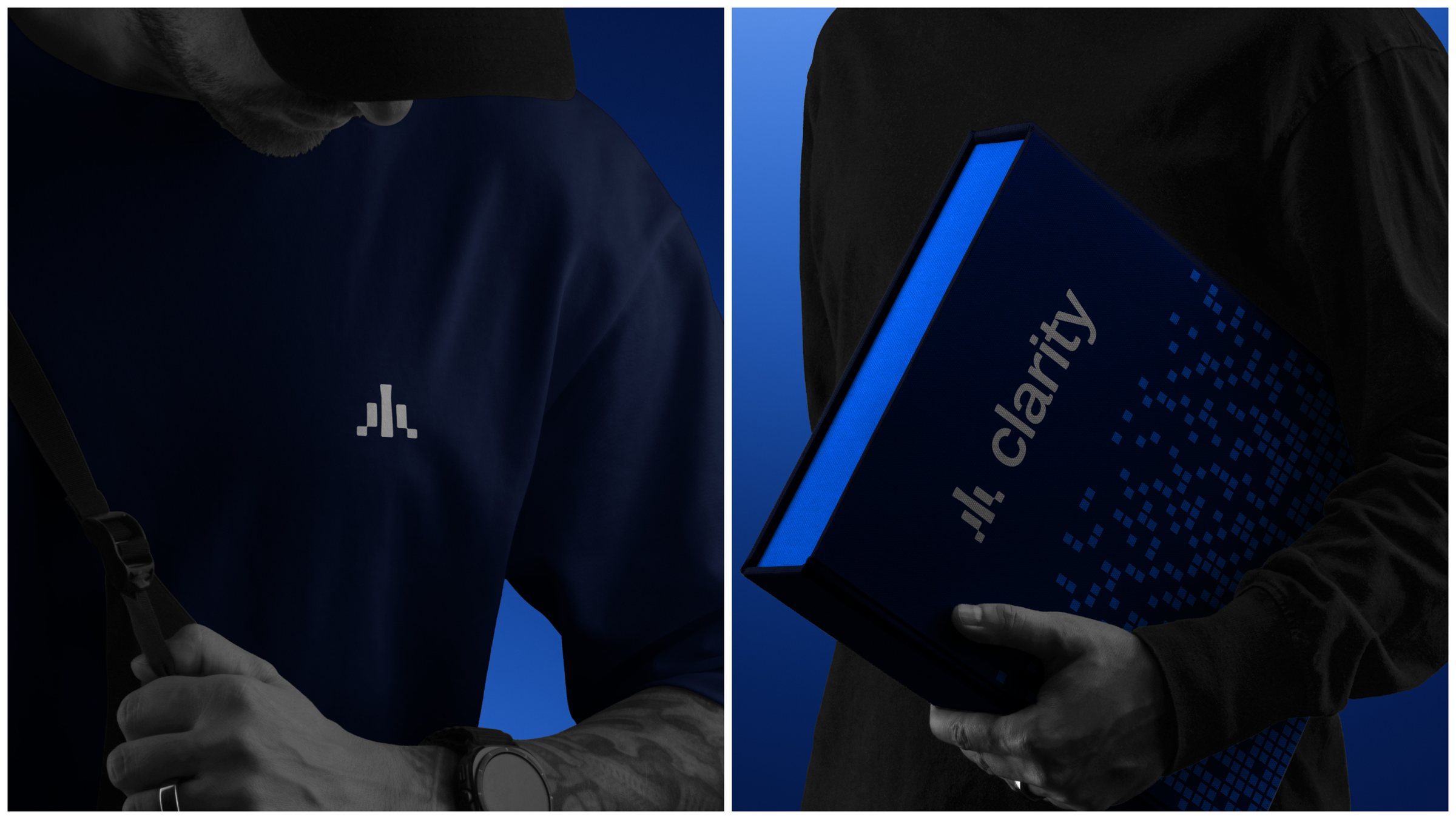
The symbol is built from simple rounded blocks that rise toward a tall central pillar, a quiet nod to growth and to the focus Clarity brings to every project.
Built for Every Surface
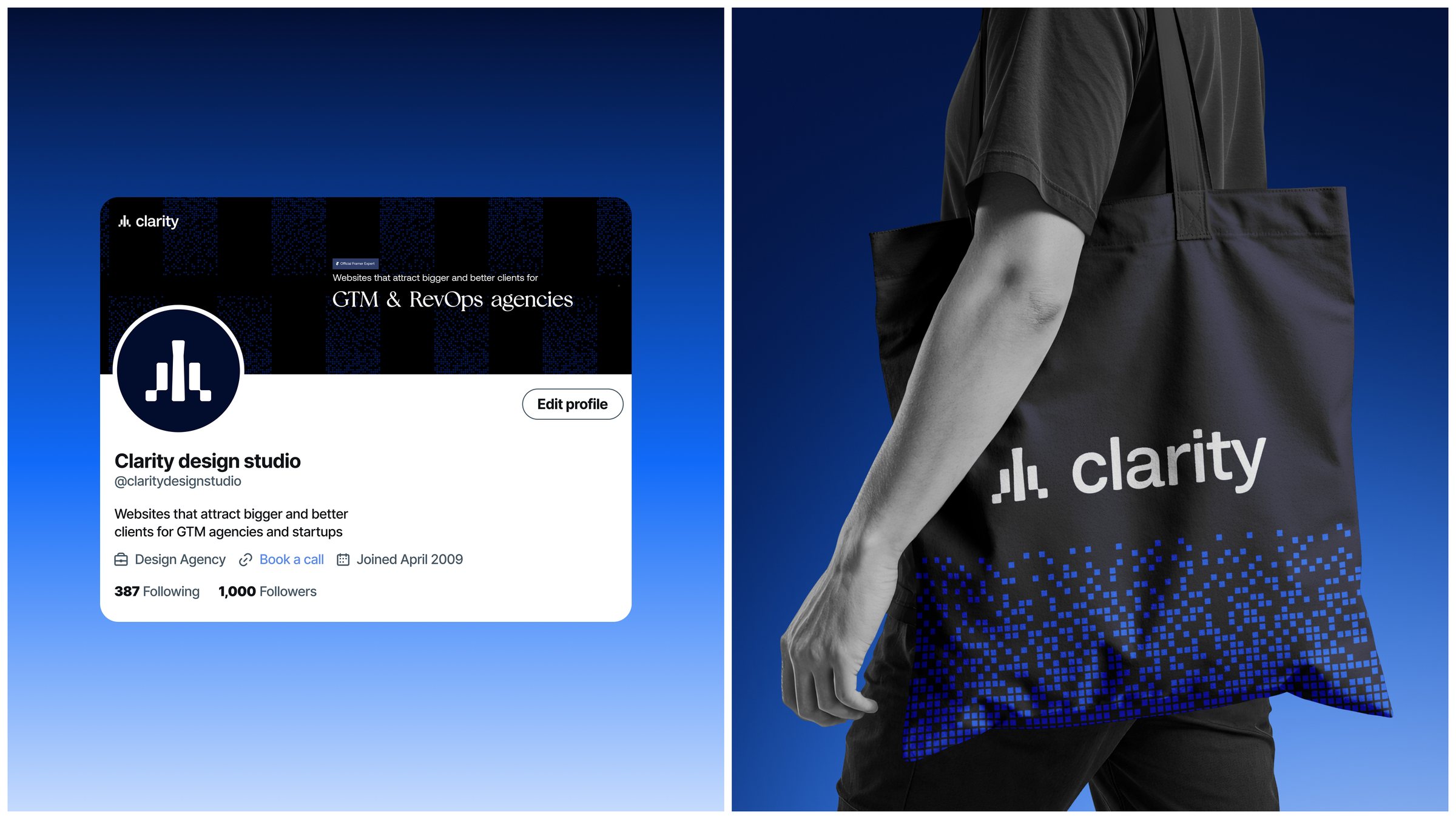
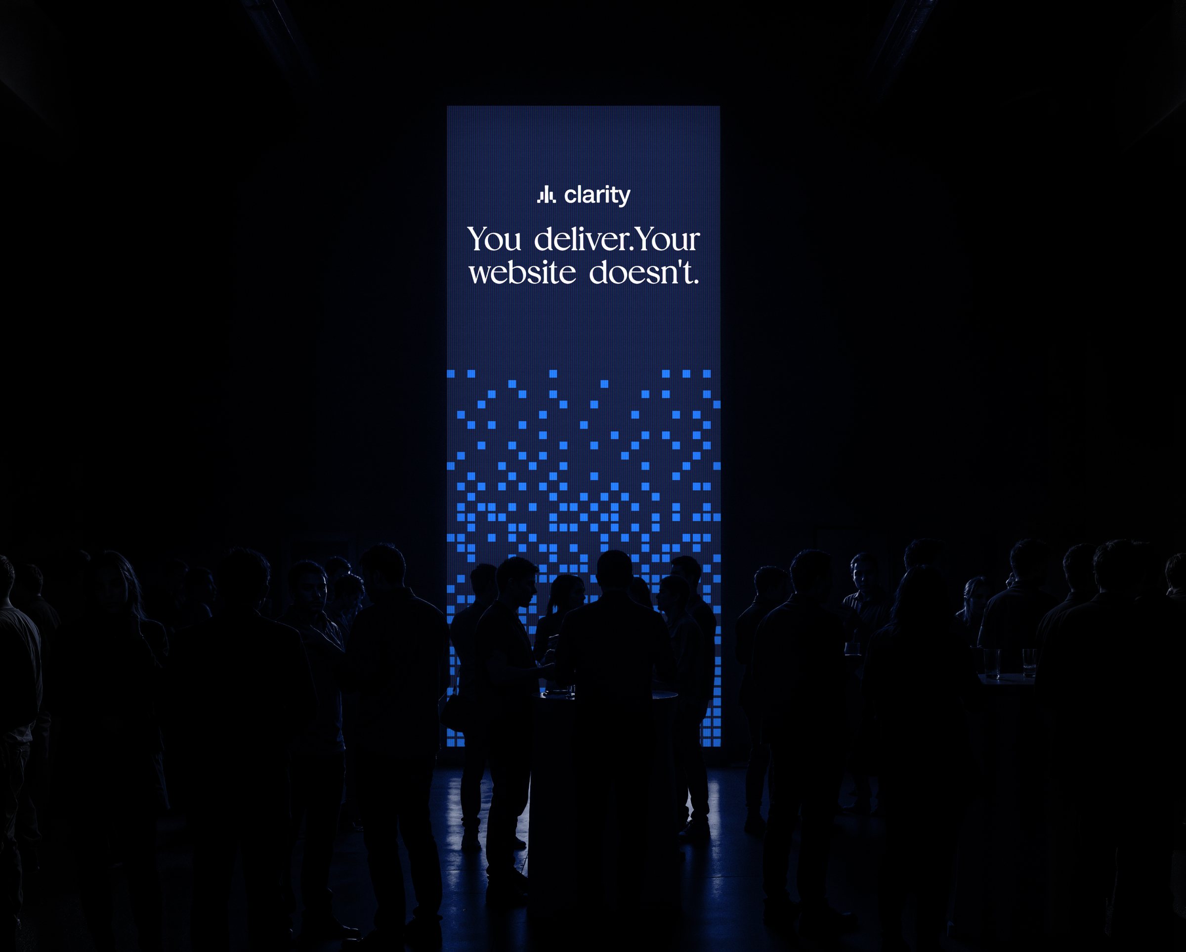
Refined enough for enterprise clients. Direct enough to sell itself.
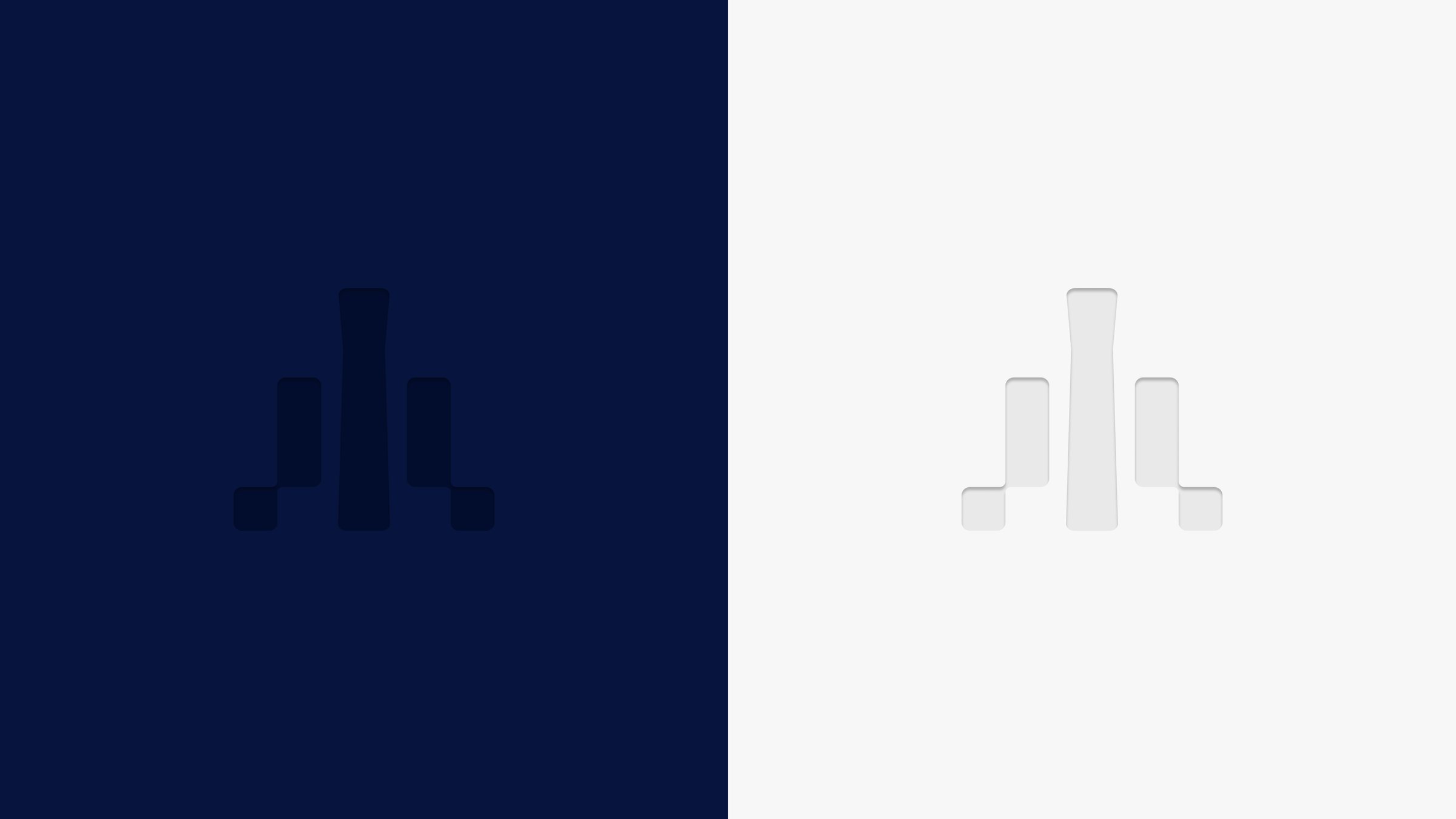
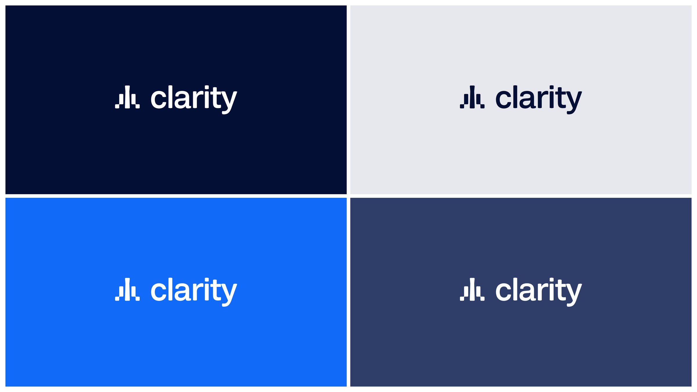
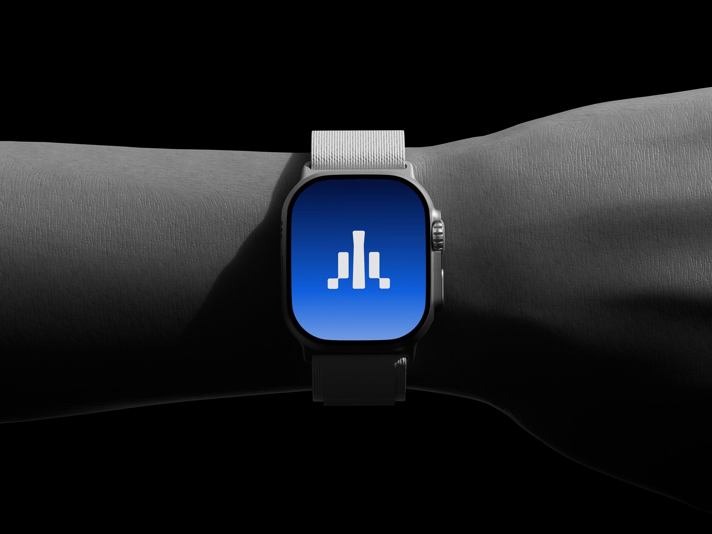
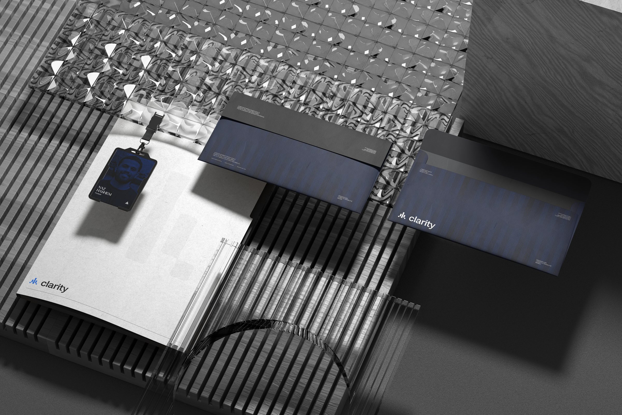
The mark holds up just as well as a subtle embossed detail as it does at full contrast, on dark and light surfaces alike.
Colour & Lockup
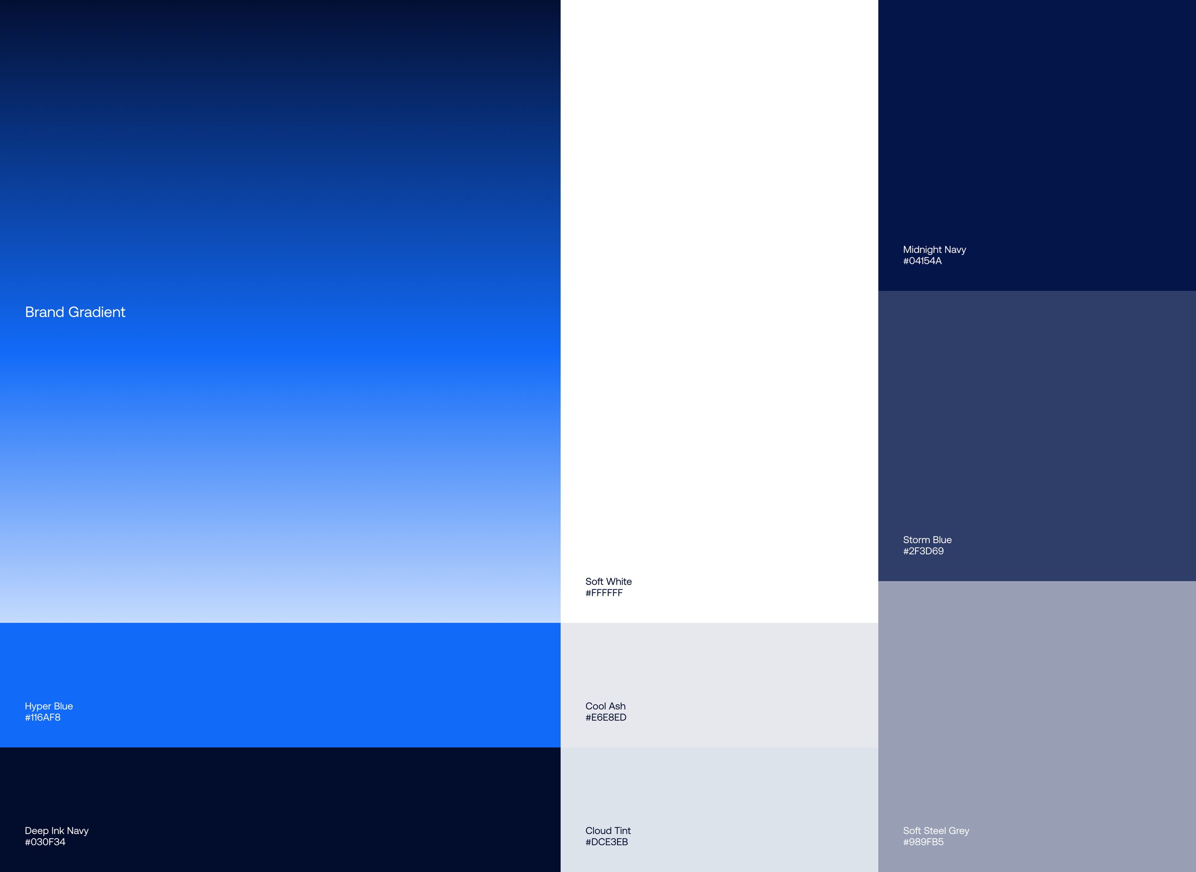
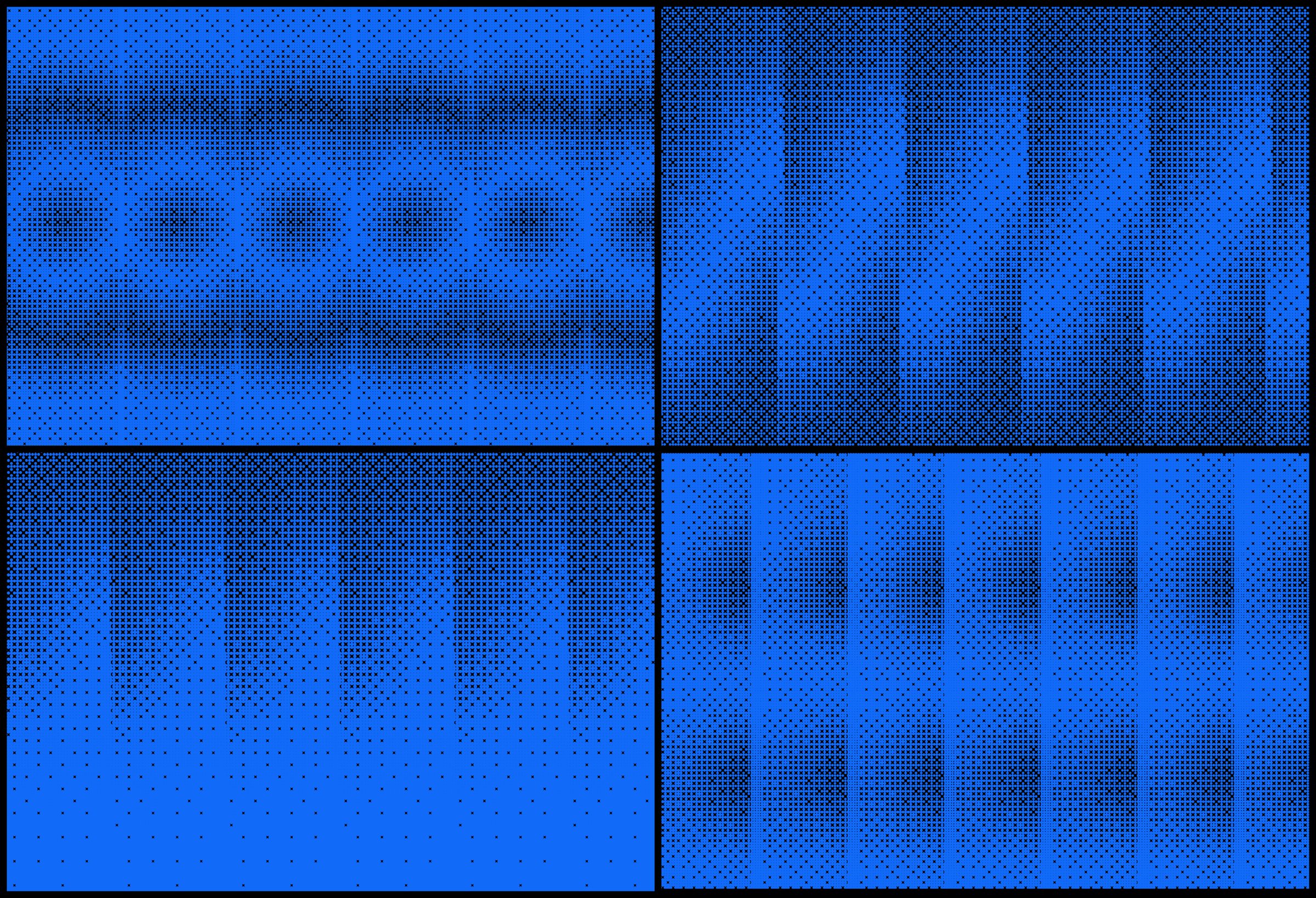
The palette moves from Deep Ink Navy (#030F34) and Midnight Navy (#04154A) to Hyper Blue (#116AF8), balanced by Soft White, Cool Ash, and Cloud Tint.
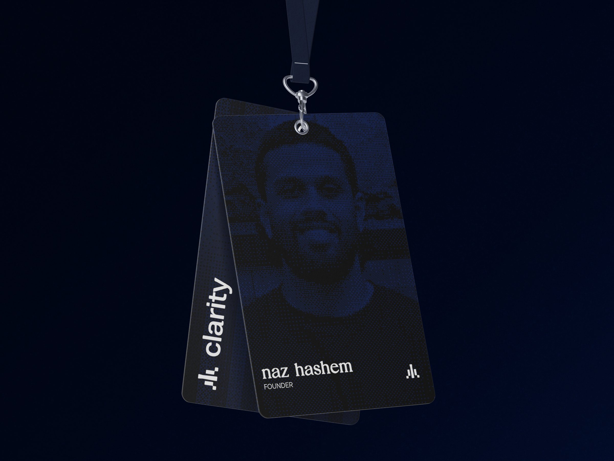
The symbol pairs with a clean lowercase wordmark and holds its legibility across every brand colour.
Primary Typeface
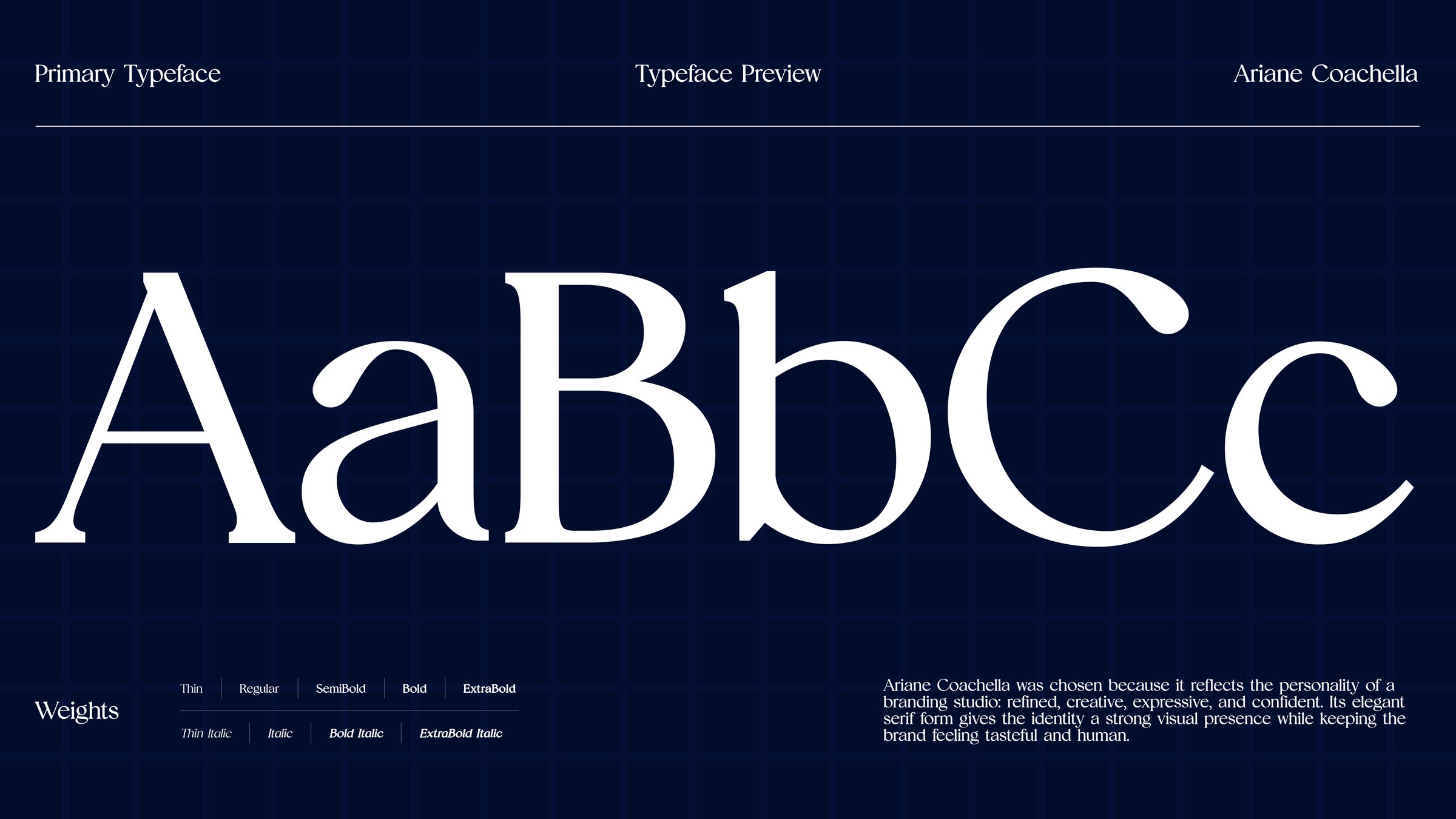
Ariane Coachella, an elegant serif, carries the headlines. It reflects the personality of the studio: refined, creative, expressive, and confident, while keeping the brand tasteful and human.
Secondary Typeface
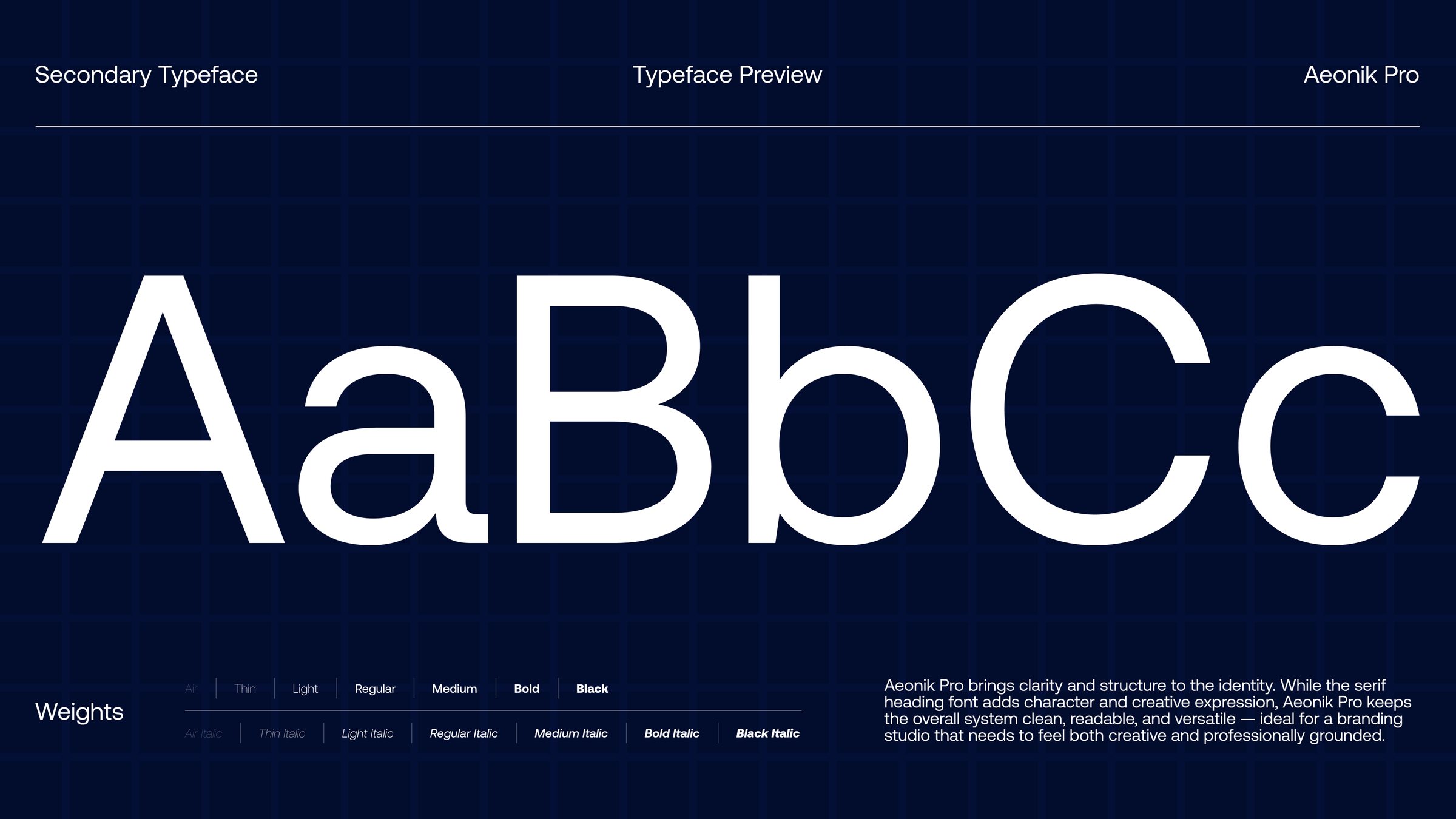
Aeonik Pro brings clarity and structure. It keeps the system clean, readable, and versatile, so the brand feels both creative and professionally grounded.
Book a call
Let's make something happen.
Building a product, launching a startup, or rethinking your website? Pick a time that works for you and let's talk through your project, goals, and next steps.